USABILITY STUDY · DESKTOP WEB
An exploratory usability test to improve Airbnb's search & filter features
OBJECTIVE
This remote, moderated usability test on Airbnb's desktop website examines how users interact with search and filter functions during a typical task. The goal is to gather insights on user behavior, identify usability issues such as navigation challenges or filter effectiveness, and develop design recommendations.
MY ROLE
(in collaboration with fellow UX student)
Research
Preparing and conducting usability tests
Redesign
TOOLS

Figma

Zoom

DocuSign

Forms

Airbnb
DURATION
Research — 3 days
Usability testing — 3 days
Redesign — 2 days
The challenge
Airbnb users often encounter challenges when searching for accommodations, such as irrelevant results or overlooked filters, which can lead to frustration and abandoned bookings.
HOW MIGHT WE
Learn about how users interact with the Airbnb website (desktop version) when searching and filtering for accommodations.
The solution
Clarify Navigation
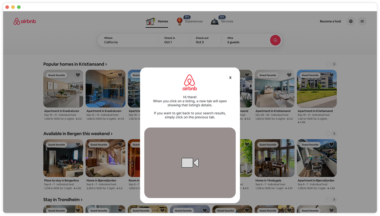
Add a modal on search results explaining that listings open in new tabs — with a looped tutorial video.
Guide Filter Selection
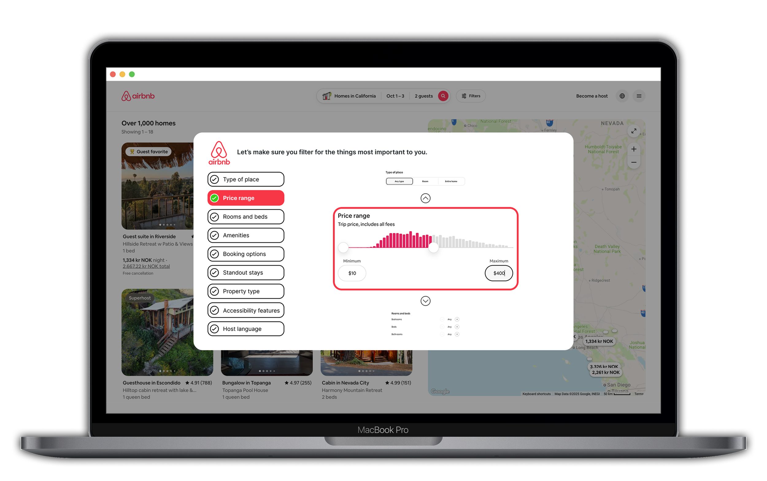
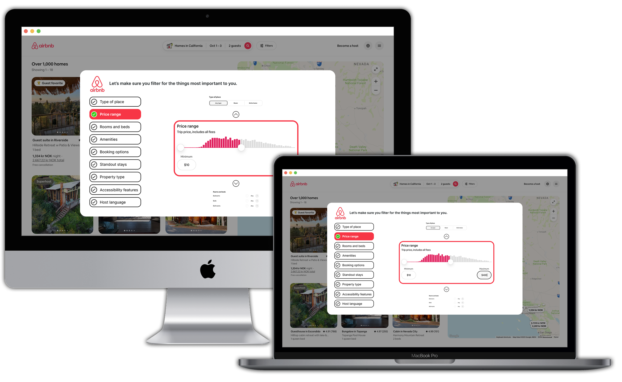
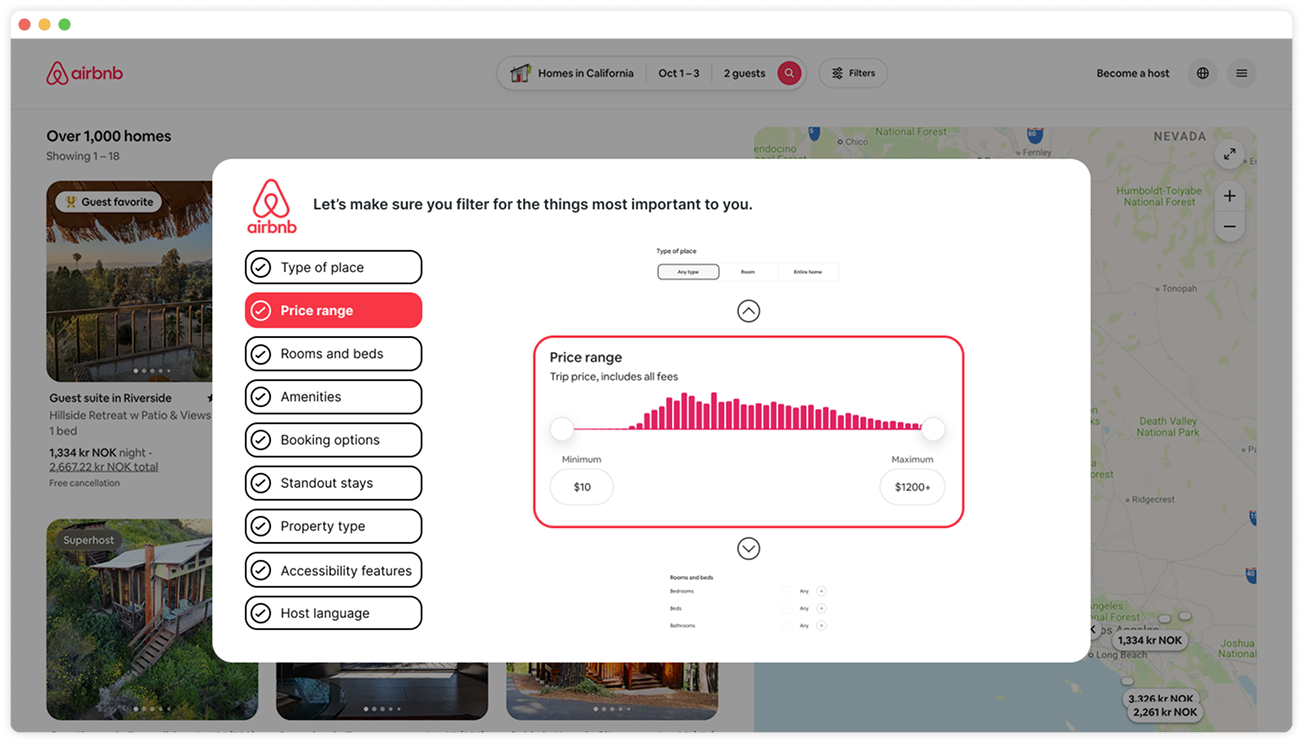
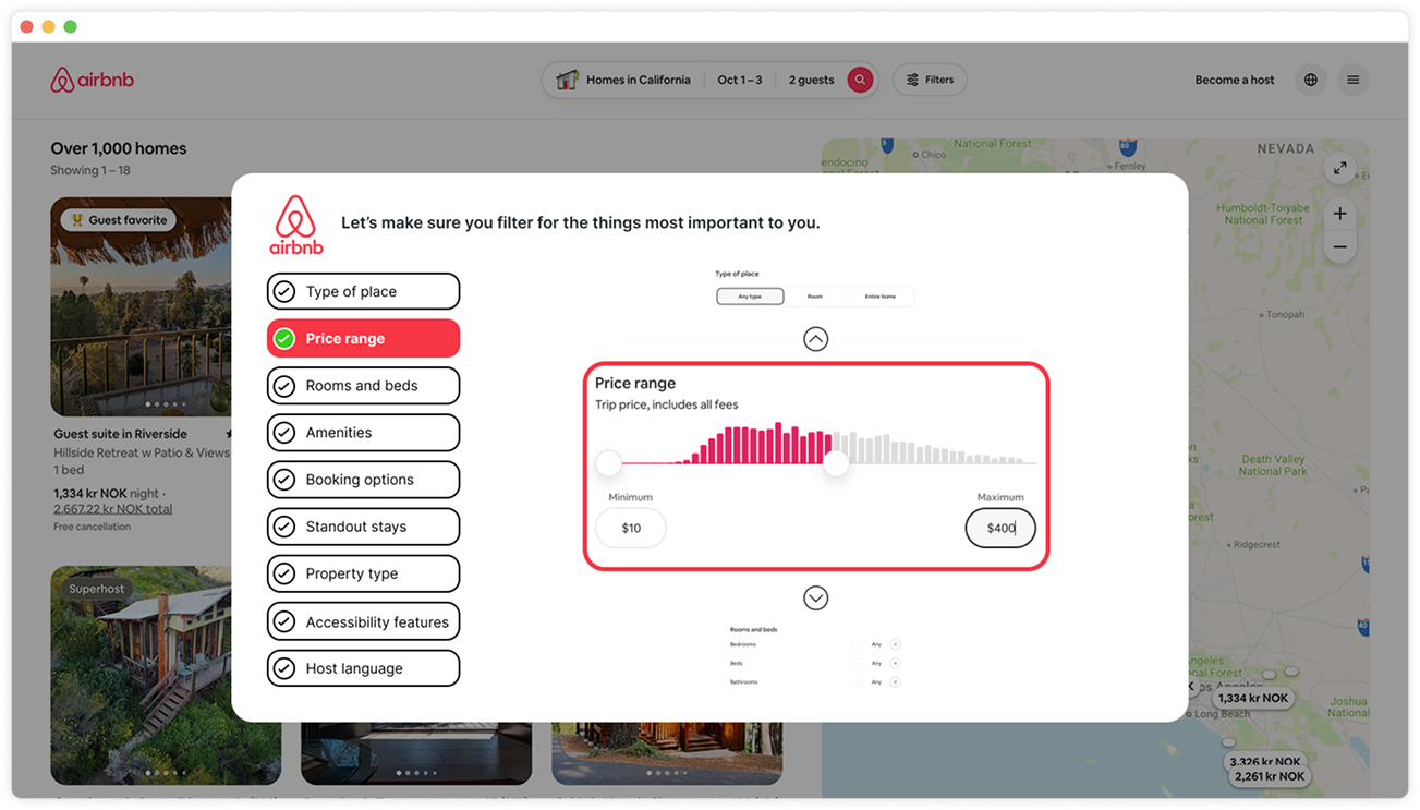
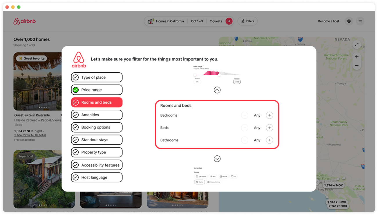
Implement a wizard interface (multi-step form) post-search — presenting filters in a carousel for guided progression.
Process
This usability testing followed a structured, user-centered approach, emphasizing exploratory insights through remote moderated sessions.

Empathise
Understand the user's needs and perspectives through observation and engagement.

Define
Clearly articulate the problem statement based on insights gathered.

Ideate
Generate a wide range of creative solutions.

Prototype
Design tangible representations of ideas to explore solutions.

Test
Evaluate and refine prototype through user feedback.
Metrics
We measured success via three key metrics.
01
Task completion (yes / no).
02
Time to complete.
03
User satisfaction (rated 1–5 for search / filters and overall experience).
These ensured data-driven recommendations.
Research & planning
Participant Recruitment
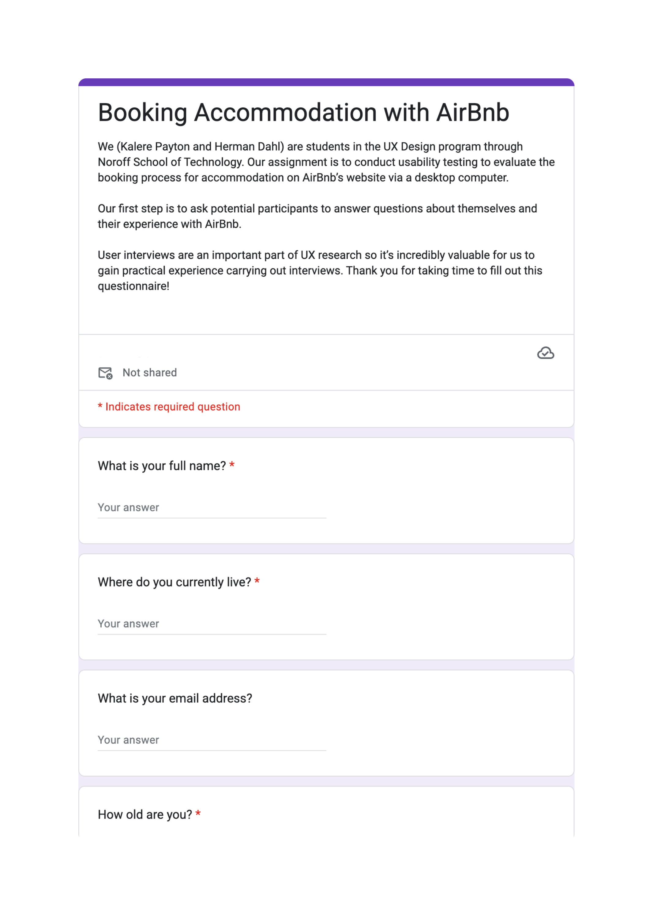
A screener was created and published on social media to collect demographic information, Airbnb experience, and availability.
Consent forms were provided, along with incentives.
Ethical considerations involved ensuring GDPR compliance, maintaining participant anonymity, and prioritizing participant comfort.
Session Preparation
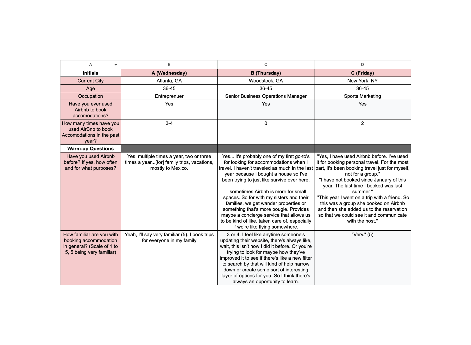
Facilitated remote-moderated, task-based tests with think-aloud protocols.
Scripted sessions for neutrality, including warm-ups and post-task surveys.
Piloted the script with a non-participant to refine timing and recording.
Testing & iteration
Key findings from sessions
User A
Filter modal stalled; irrelevant Mexico results; frustration with the budget slider.
User B
Misclicked map narrowed results; flexible dates defaulted incorrectly; struggled with the breakfast filter.
User C
Issues with flexible dates and an unenforced breakfast filter.
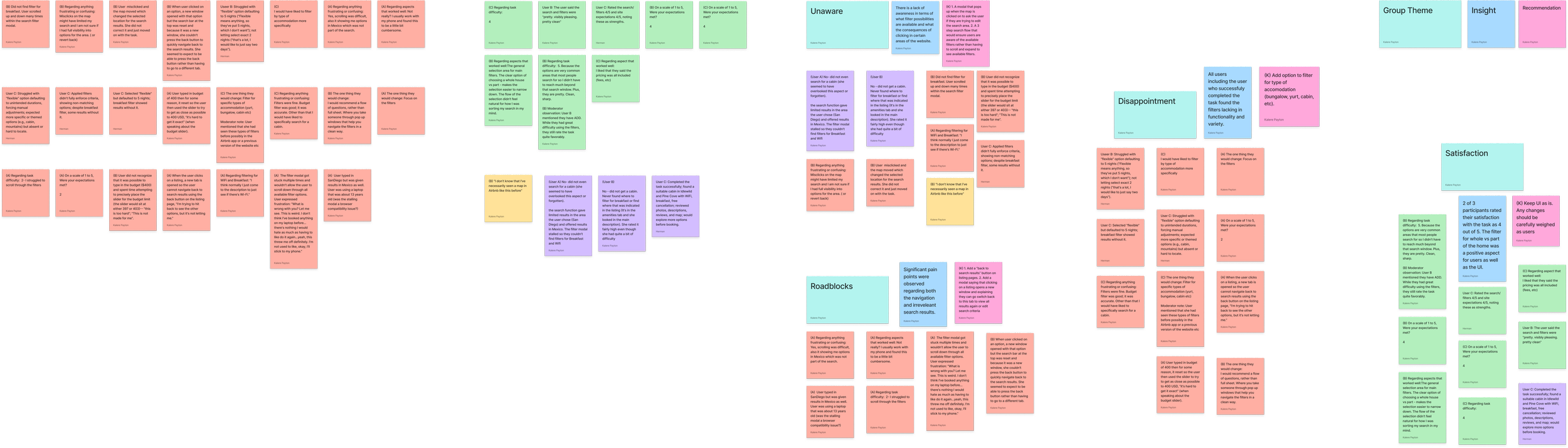
“Make sense of it all” — affinity mapping to cluster findings into themes.
Insights
Unaware
Lack of filter awareness (e.g. missing amenities in previews).
Disappointment
Filters lacked specificity (e.g. no accommodation type like “cabin”).
Roadblocks
Navigation issues between results and listings; irrelevant results.
Satisfaction
Clean UI appreciated; 2 / 3 rated 4 / 5 overall.
Recommendations
Unaware
Add a modal when the map is clicked, asking the user if they want to edit the search area.
Disappointment
Enhance filter logic and provide real-time previews of active filters to better align with expectations.
Roadblocks
Add an option to filter by accommodation type (bungalow, yurt, cabin, etc.); implement a multi-step wizard interface to guide users through filter selection.
Satisfaction
Keep sharp, minimal designs in future iterations; add a modal explaining that clicking a listing opens a new window, and how to switch back.
Metrics Report
Varied task completion; average time highlighted inefficiencies; satisfaction provided qualitative depth.
Full solution
Based on findings, we proposed targeted improvements.
Clarify Navigation
Add a modal on search results explaining that listings open in new tabs, with a looped tutorial video.
Guide Filter Selection
Implement a wizard interface (multi-step form) post-search, presenting filters in a carousel for guided progression.
Outcomes
Enhanced filter logic and visibility could improve task efficiency and satisfaction.
Reflection
Future A/B testing on the wizard could validate reductions in frustration; scalability to mobile was noted as a next step.