INJURY RECOVERY · IOS android
A case study in designing an injury recovery mobile app
OBJECTIVE
Designing a mobile app to support injury recovery by reminding users to do physical therapy. Aiming to shorten recovery time and collect data for research. The app is adaptable for any injury journey, addressing physical and emotional challenges.
MY ROLE
(in collaboration with fellow UX student)
UX Research (Persona development)
Information Architecture
Ideation (Sketches)
Prototyping (Low-fidelity and High-fidelity)
UI Design
Accessibility Considerations
TOOLS

Figma
DURATION
May – June 2025
The challenge
Recovery from shoulder injuries like rotator cuff tears is demanding and emotionally taxing, especially for individuals like Chris (persona), whose identity is tied to sports. Users often forget rehab exercises, prolonging recovery. The app must collect research data without overwhelming users, promoting consistency and mindfulness.

HOW MIGHT WE
Encourage users recovering from injuries to consistently perform their physical therapy exercises and track recovery data, while supporting their emotional well-being and collecting data for medical research?
The solution
REvive
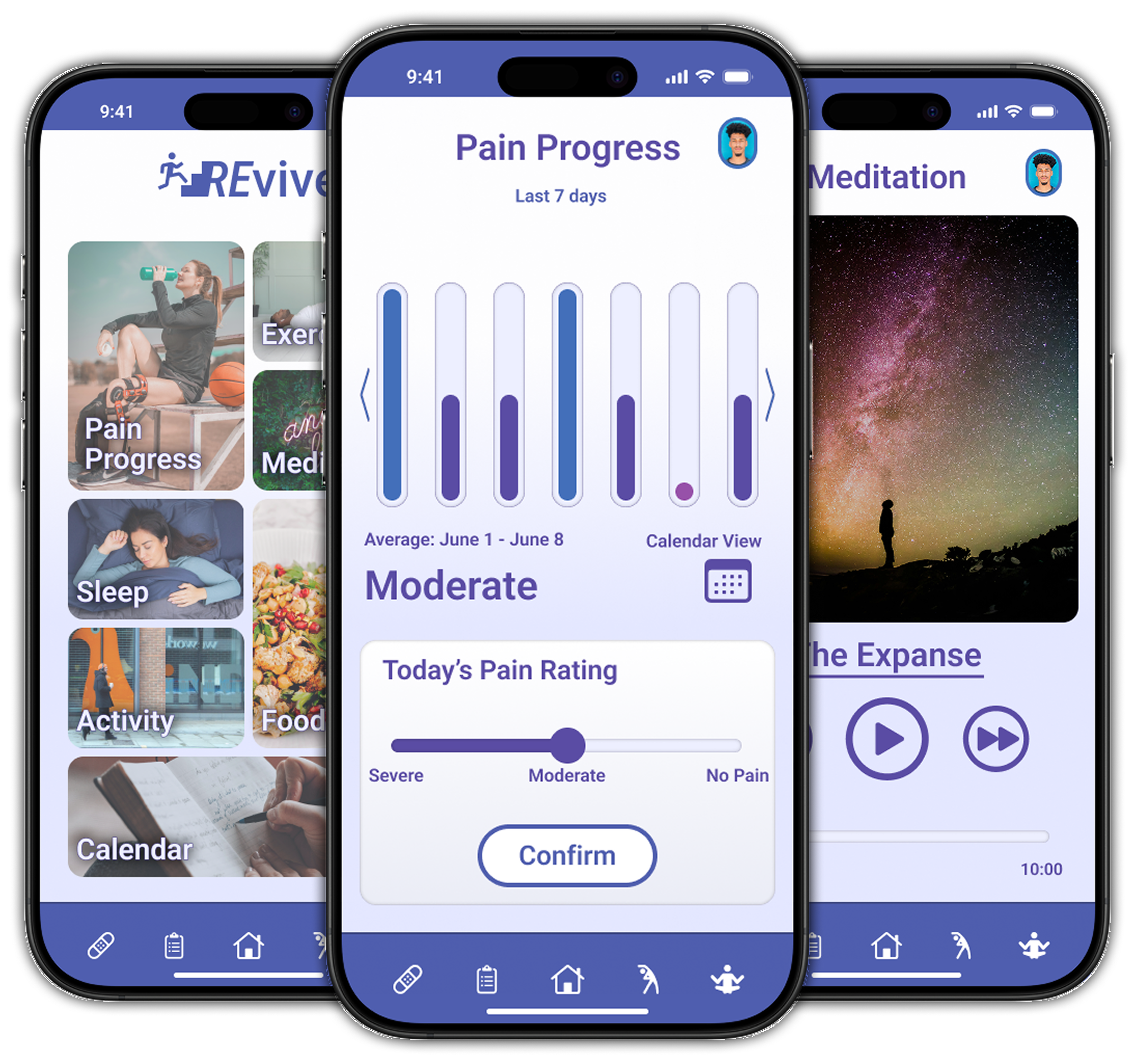
Is an iOS mobile app that streamlines data entry and provides supportive features to accelerate recovery. It gathers user-input data for research while offering visualizations to encourage progress.
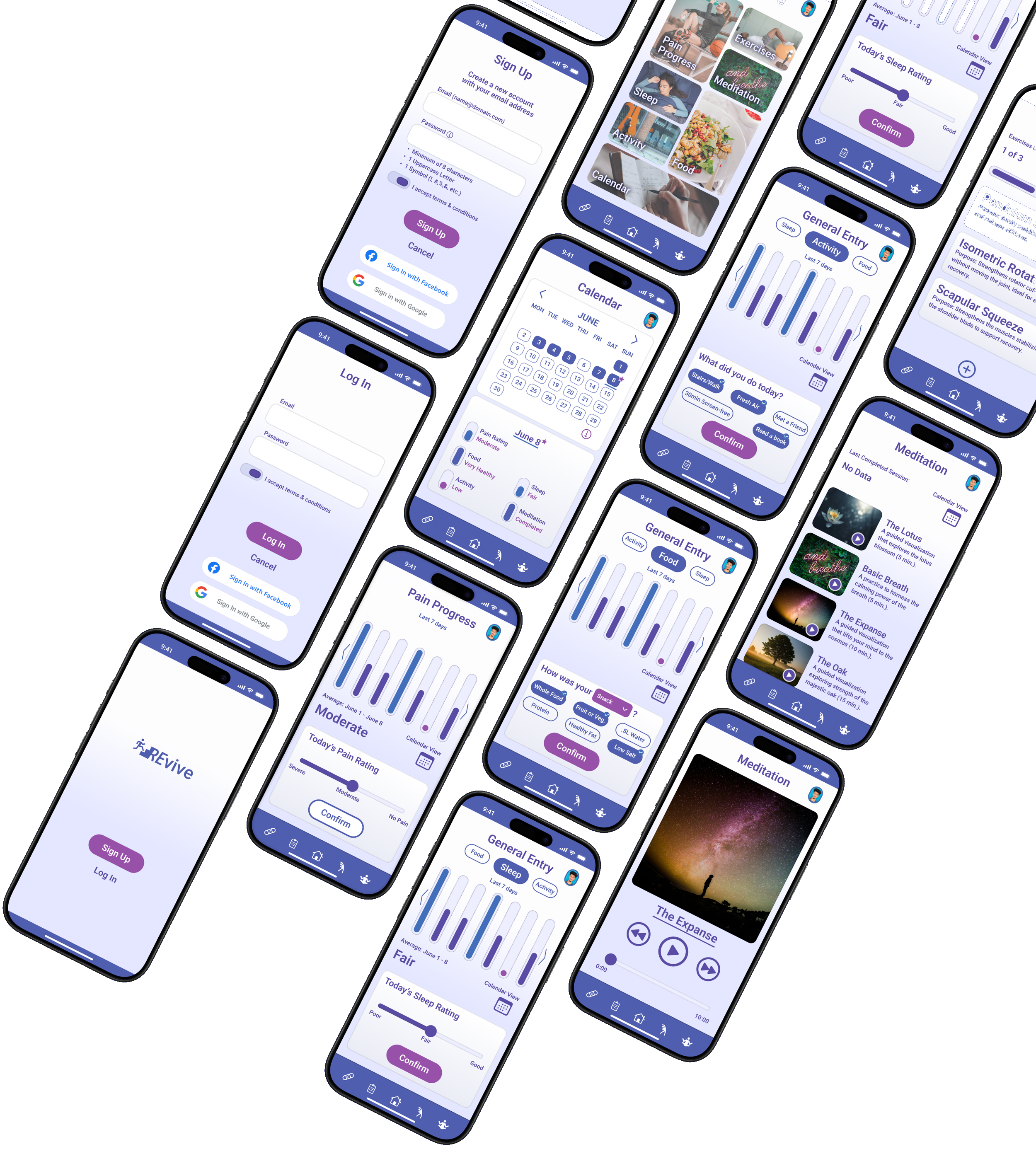
Key features
Pain Progress Tracking
Simple slider for rating pain levels (No Pain, Moderate, Severe) with bar graph summaries over 7 days or 4 weeks.
General Entry
Quick selectable tags for logging meals/snacks (e.g., Whole Food, Protein), sleep quality (Poor, Fair, Good), and activities (e.g., Stairs/Walk, Read a Book) to promote healthy habits without complexity.
Exercise Tracker
User-added exercises with sets/reps/time; expandable cards for details and completion marking, plus progress bar.
Meditation
Audio-guided sessions (e.g., Basic Breath, The Expanse) with playback controls and completion logs.
Calendar View
Skeuomorphic design showing daily data summaries via color gradients and shapes for at-a-glance insights.
User Flow for Onboarding
Streamlined sign-up/login with error modals and social options (Google, Facebook).
Process
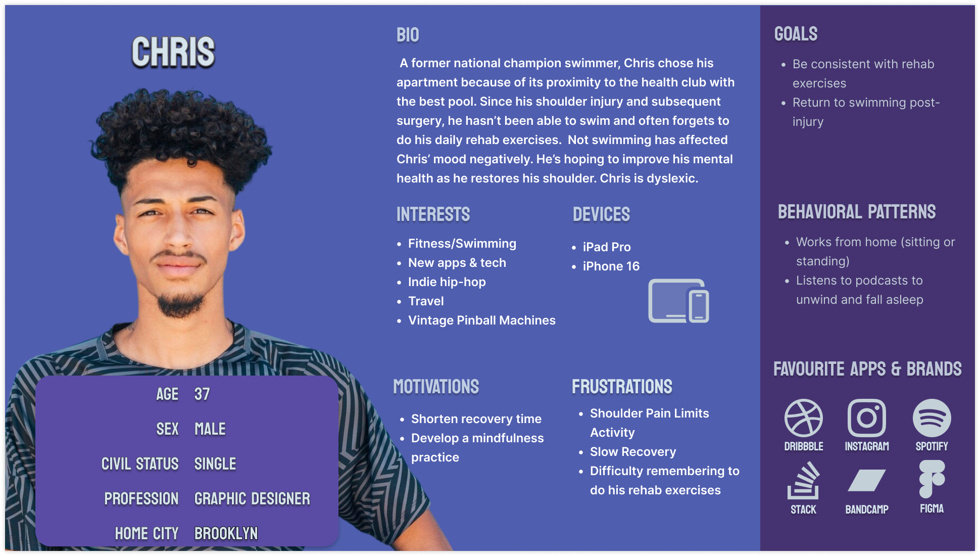
Built upon the provided challenge's user persona, “Chris” – a 37-year-old graphic designer and former swimmer recovering from shoulder surgery.
Story board
User profile
Chris is a 37-year-old male swimmer who maintains a regular exercise routine for health benefits; he is a former national competitor and works as a home-based graphic designer.
Injury details
Recently sustained a shoulder injury (rotator cuff tear) requiring surgery; several weeks post-surgery, he experiences limited shoulder movement and ongoing pain that impacts his work productivity.
Recovery challenges
Desires to accelerate recovery but often forgets to perform prescribed physiotherapy exercises, leading to frustration and stress regarding the healing timeline; physiotherapist estimates a three-month recovery period.
Tech preferences
Tech-savvy individual who enjoys exploring new apps; currently uses digital tools to track his mood and hopes for an app that provides exercise reminders and progress monitoring.
Emotional and identity aspects
Injury affects his emotional well-being, as his identity is tied to sports and fitness; seeks support to manage mental health during recovery.
Ideation
Recovery can be emotional; the app should motivate rather than burden him. It is essential that the app's design promotes and supports Chris without overwhelming him.
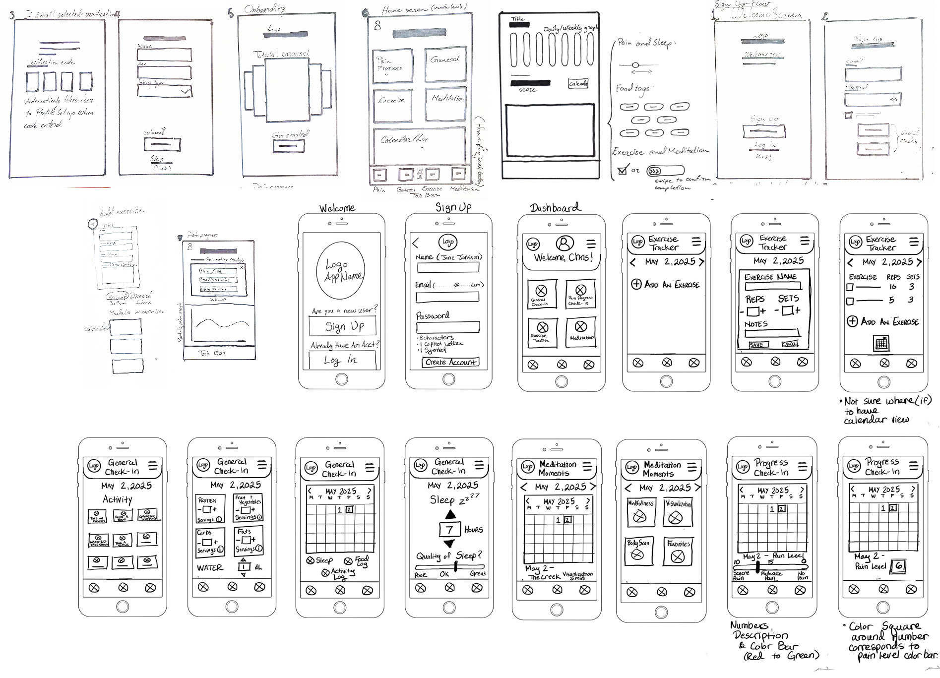
Sketches
User flow
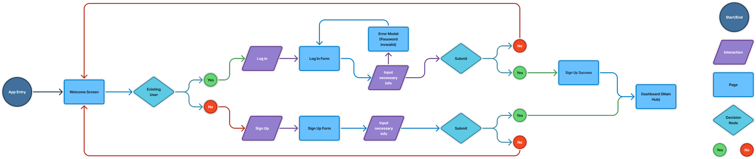
The app's user flow focuses on first-time registration for Chris, ensuring a seamless onboarding. It includes welcome screens, sign-up / login forms with immediate error feedback (e.g. invalid-password modal), and direct access to the dashboard.
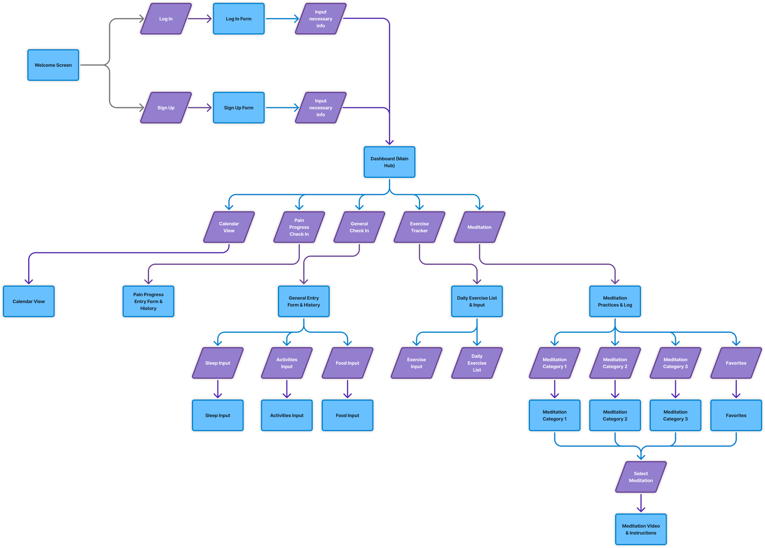
Information architecture
Recovery can be emotional; the app should motivate rather than burden him. It is essential that the app's design promotes and supports Chris without overwhelming him.
Low fidelity
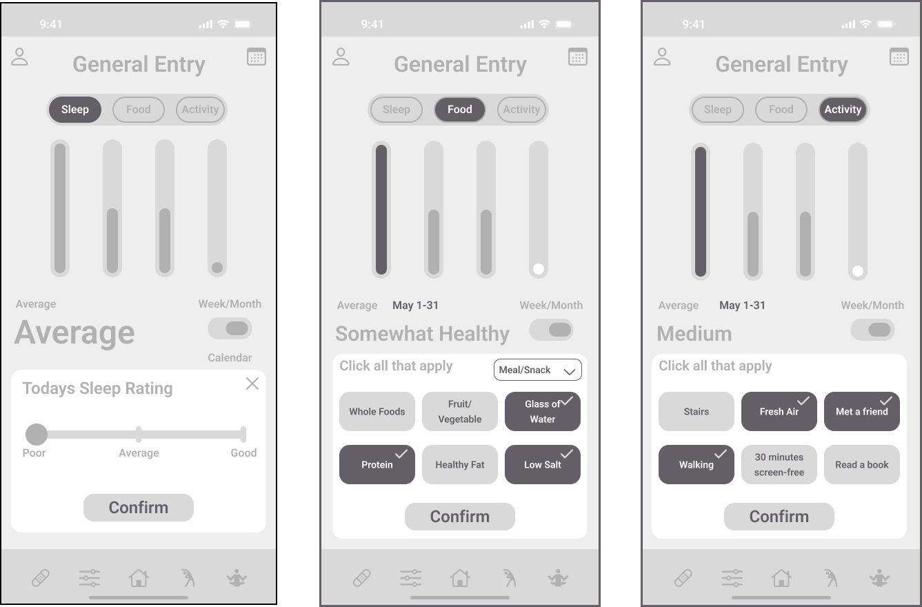
We focused on enhancing efficiency in navigation and data entry to motivate our user persona, Chris, to use the app daily.
—
The sign-up and log-in processes follow familiar design patterns for ease of use.
—
Information is presented clearly while reducing clutter.
—
Data entry is simplified through recognition instead of recall.
—
Cards structure the exercise and meditation content for better organization.
High fidelity
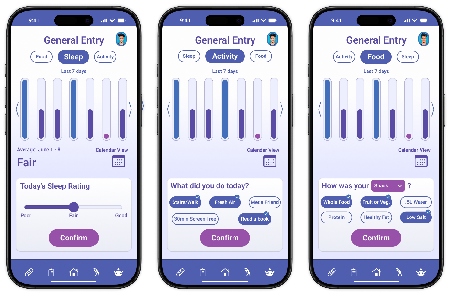
Scaling up the design to high-fidelity using the ideated solutions, focusing on layout and navigation from the low-fidelity frames. Additionally, implementing a new color palette based on the 60-30-10 rule for improved accessibility and data visualization.
—
The sign-up and log-in layout remains unchanged in high-fidelity.
—
Homescreen bento box options expand to improve clarity and ease of navigation.
—
Minor adjustments increase the negative space between data summary bars and data entry cards.
—
The upper part of the Exercise screen is simplified.
Takeaways
Simplicity in data entry encourages consistent use.
Visualizations motivate by showing progress positively (full bar = best outcome).
Bento layouts and large elements aid users with impairments.
Next: Usability testing to validate.